A family business
with a tradition
of quality
Real Estate Company: Lount Corporation
Commissioned by: Lount Corporation
Role: Design, Art Director, Identity design, Promotional Material, Web Design Technic: Digital Art

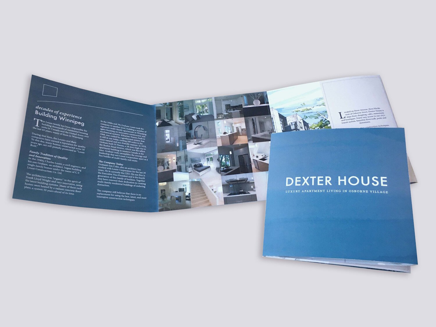
The Lount family has been responsible for building thousands of residential housing units in Canada and the United States over the last 65 years, many of them in Winnipeg. During that time, the Lounts and their companies have earned a reputation for quality. To this day, many homes, constructed some 50 years ago, are still proudly promoted as “Lount Built.”
Result
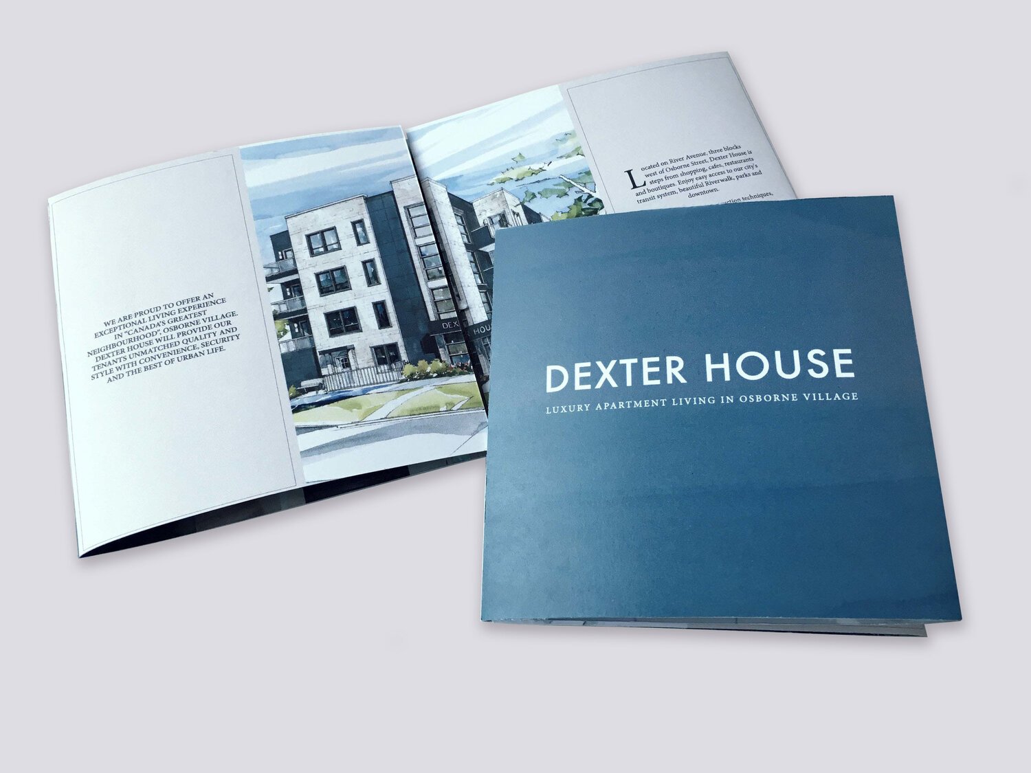
The gush company was assigned to rebrand a 75 year old real estate company that prides themselves on longevity and quality craftsmanship. The solution was to develop an identity that was was bold, architecturally pure and crisp. Their information website was developed to bridge their mid century modern buildings of the past with their new contemporary builds of the present.

Visual Identity Goal:
Create a versatile logo and visual identity that:
1 ― Captures Lount Corporation’s spirit: quality building, sophistication and timelessness
2 ― Appeals to people who enjoy quality craftsmanship and design
3 ― Doesn’t recede into the sameness of dated real estate companies while remaining classic

Wordmark and Icon
The Lount Corporation logo was created with the intention to convey a company that constructs with quality. The red and black blocks in the shape of an “L” represent the strength and resilience of their brand and buildings.The custom-made L shaped wordmark’s block figure convey’s a sense of structure and balance.
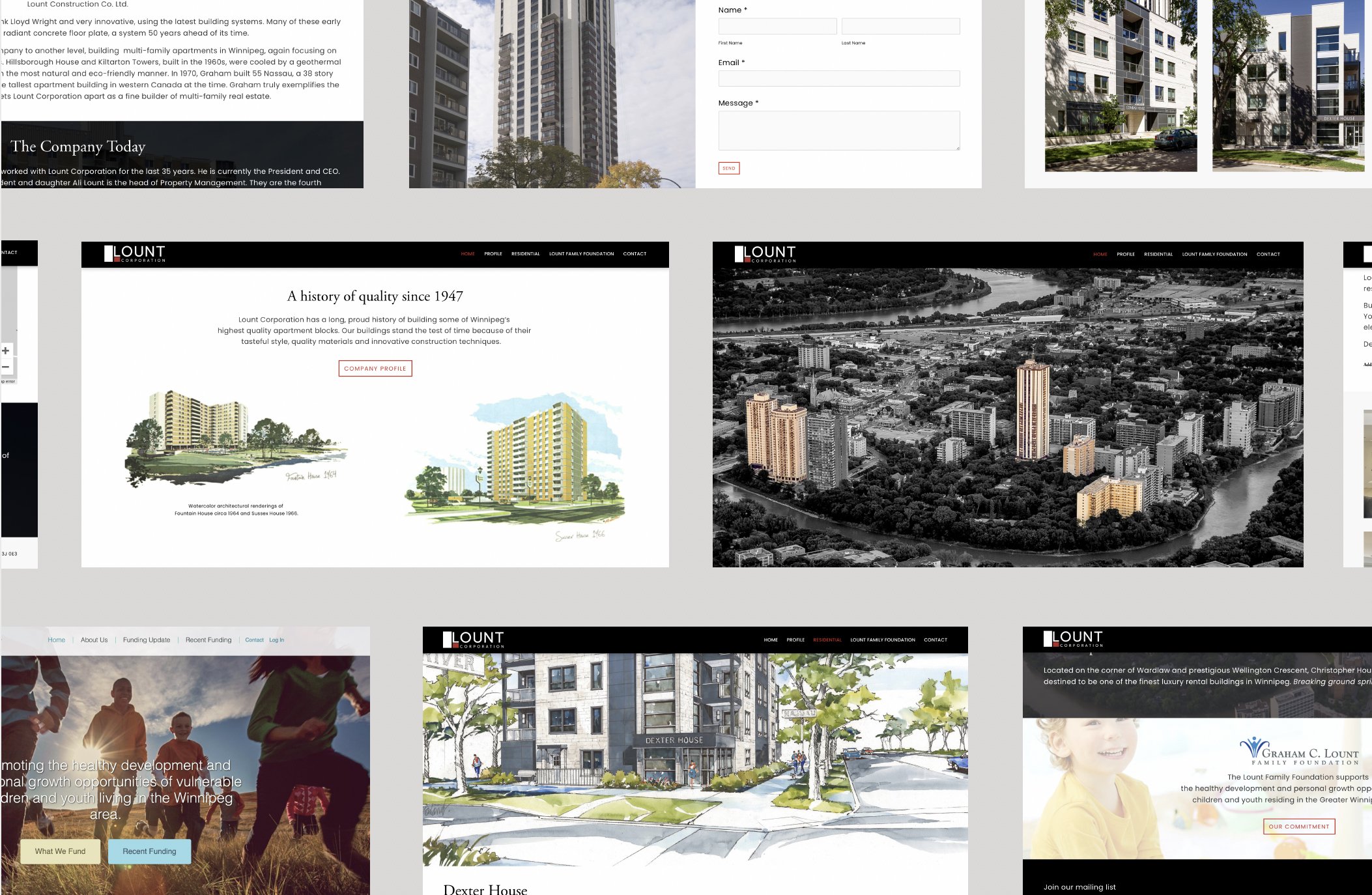
Website
The Lount Corporation wanted an information site that was modern, clean and functional.


Visual Identity Goal:
Create a versatile logo and visual identity that:
1 ― Captures Houseplant’s spirit: sustainable living
2 ― Appeals to people who enjoy quality craftsmanship and modern luxury
3 ― Doesn’t recede into the sameness of dated real estate companies while remaining innovative
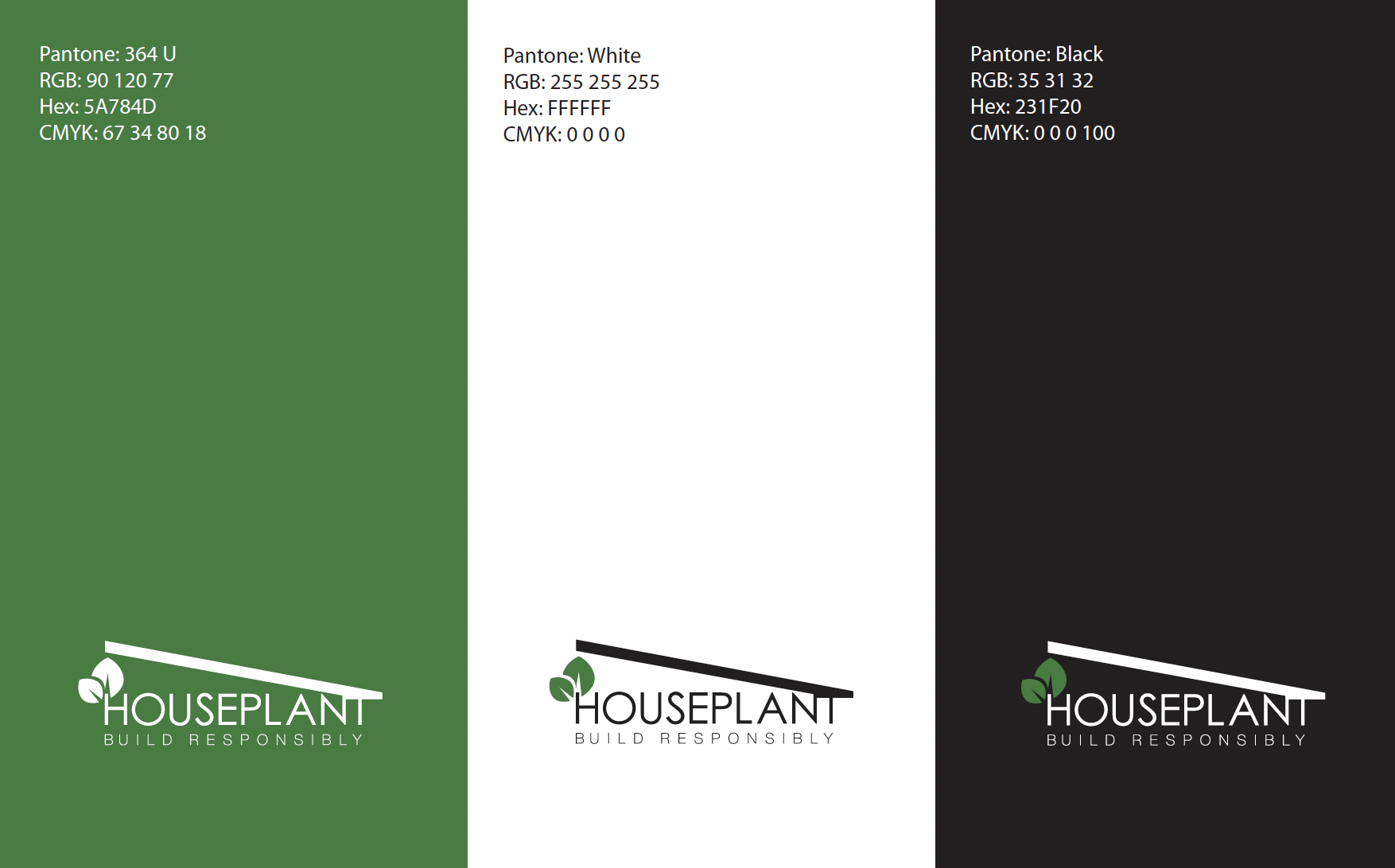
Wordmark and Icon
Houseplant was an eco friendly, single family home development project commissioned by Lount Corporation. The gush company was tasked at developing an identity that encompassed quality builds that are environmentally sound. We came to a solution by constructing a modern pitched roof that ascends from the letter T and leads your eye to simplified abstract leaf growing out of the letter H. Century font was used for its timeless and modern curvature.