The Mann Locker Experience
Reimagining the guest experience through thoughtful environmental branding.
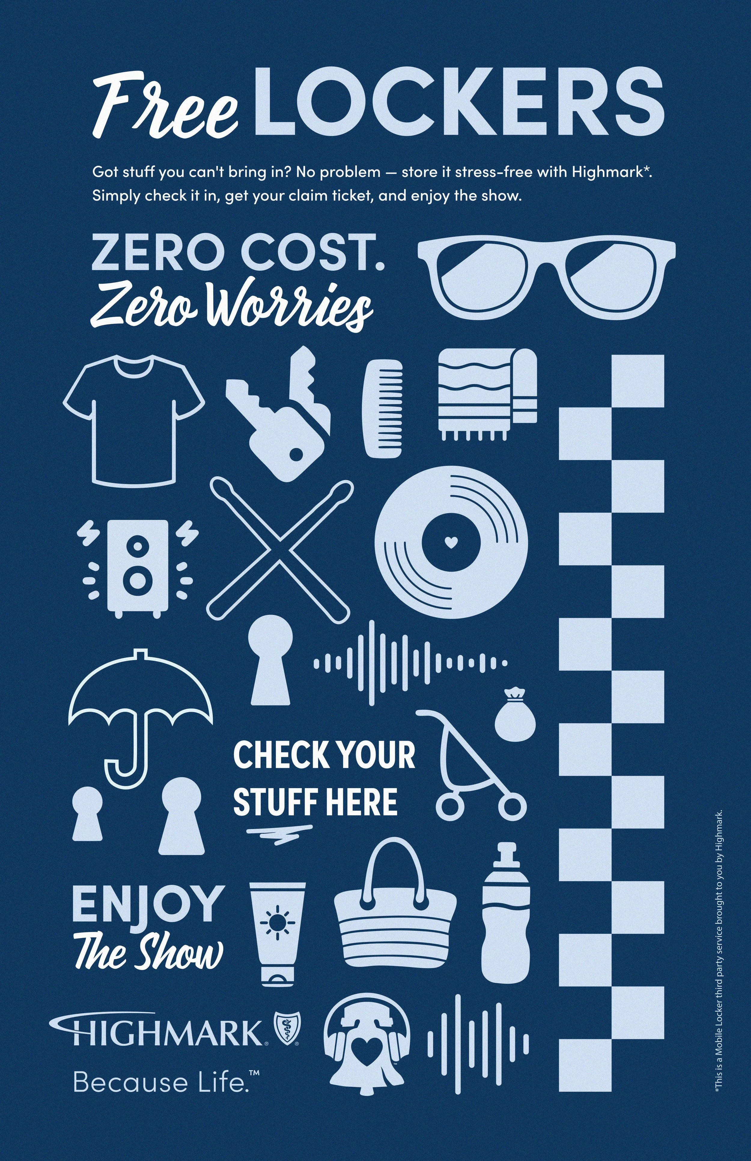
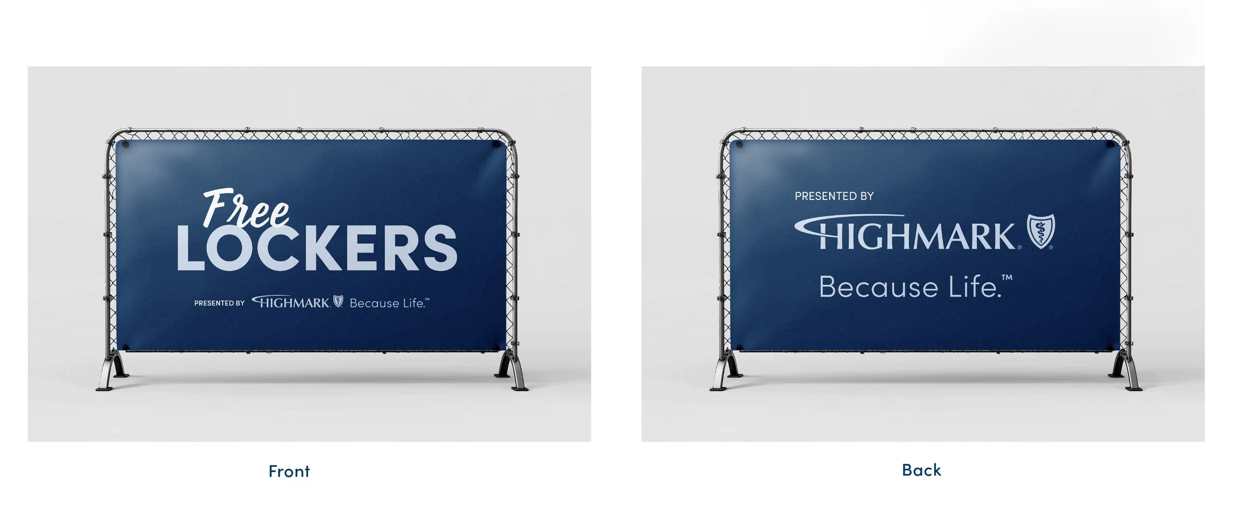
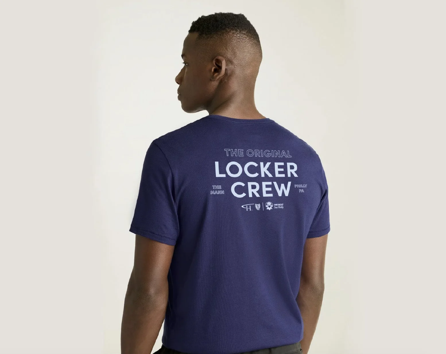
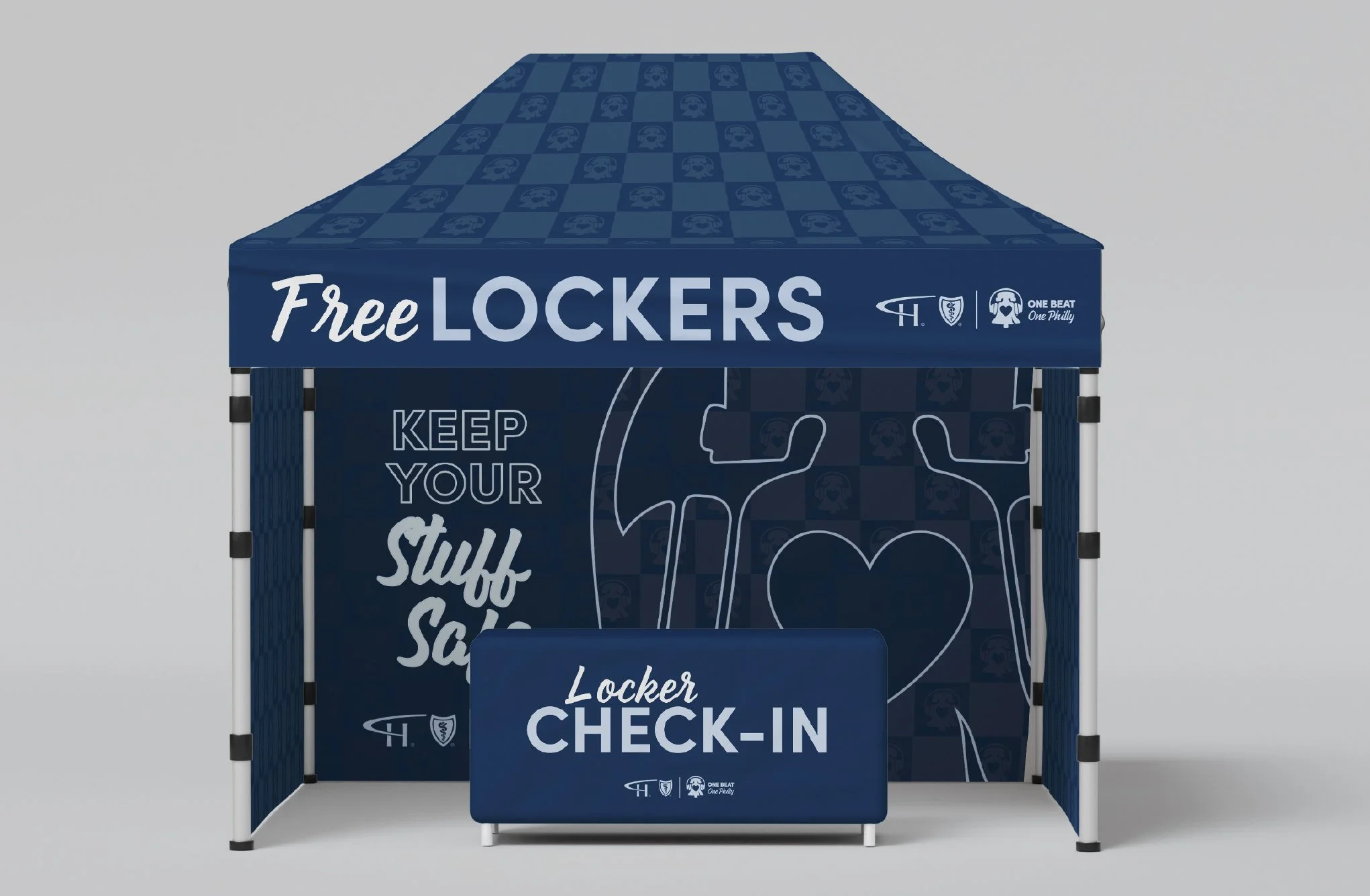
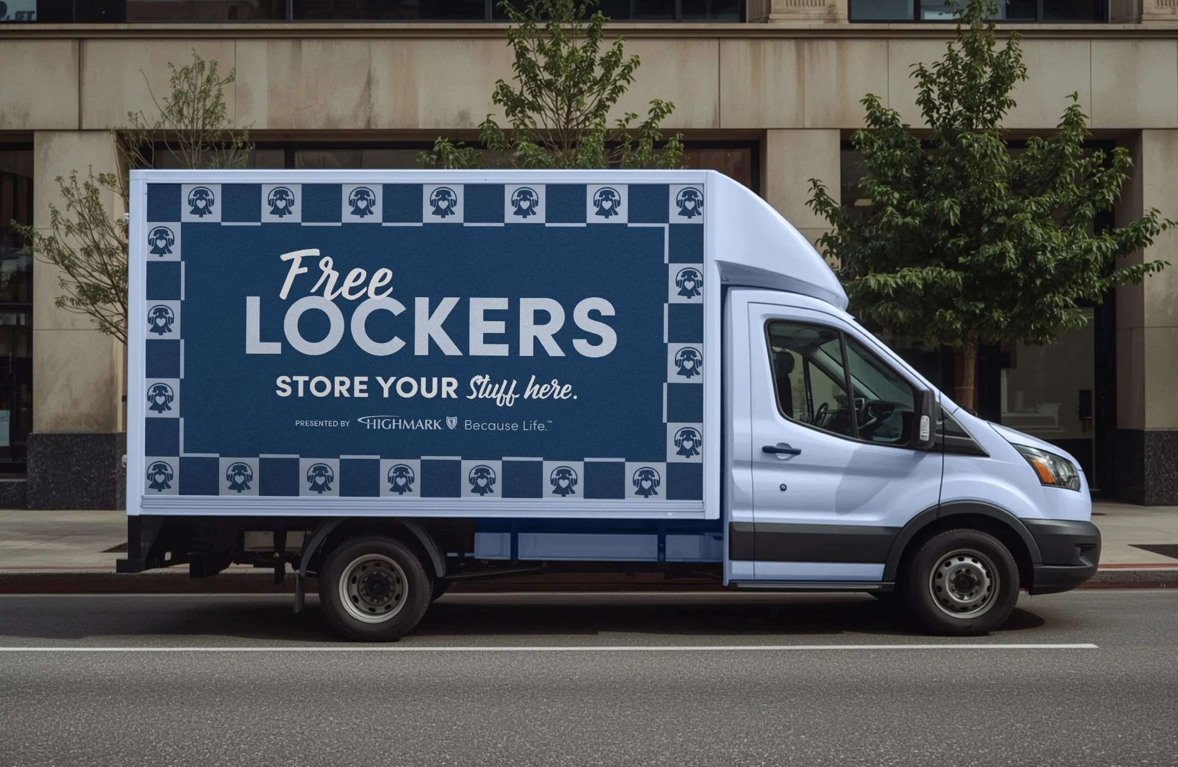
Highmark partnered with The Mann Center to create a branded locker experience that was both functional and memorable. A custom visual system—including environmental graphics, signage, icons, and branded structures—helped visitors navigate the experience while reinforcing Highmark's commitment to convenience and care.
Client: Highmark Health
Commissioned by: The Gush Company
Role: Environmental Branding • Experiential Design • Art Direction • Production
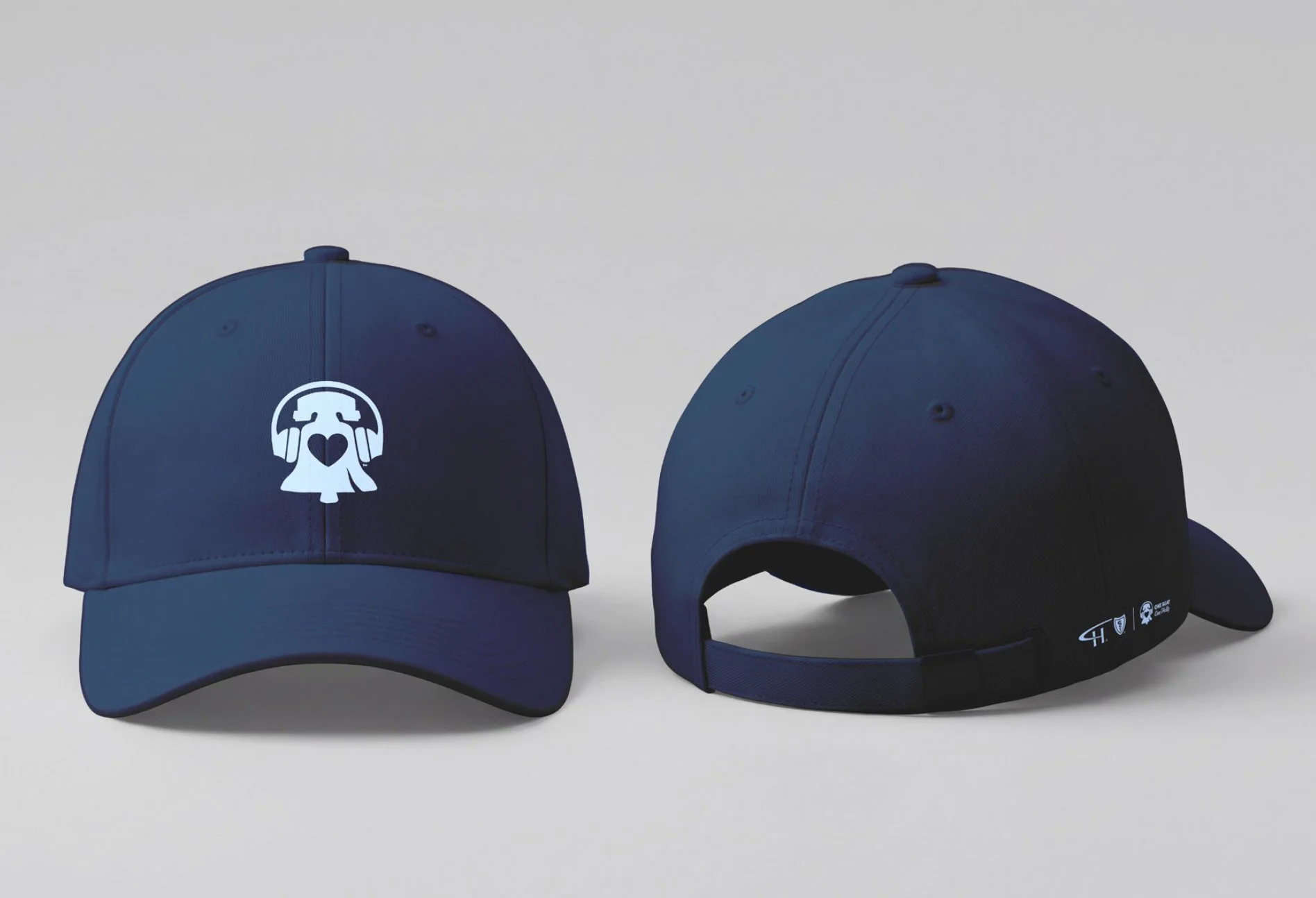
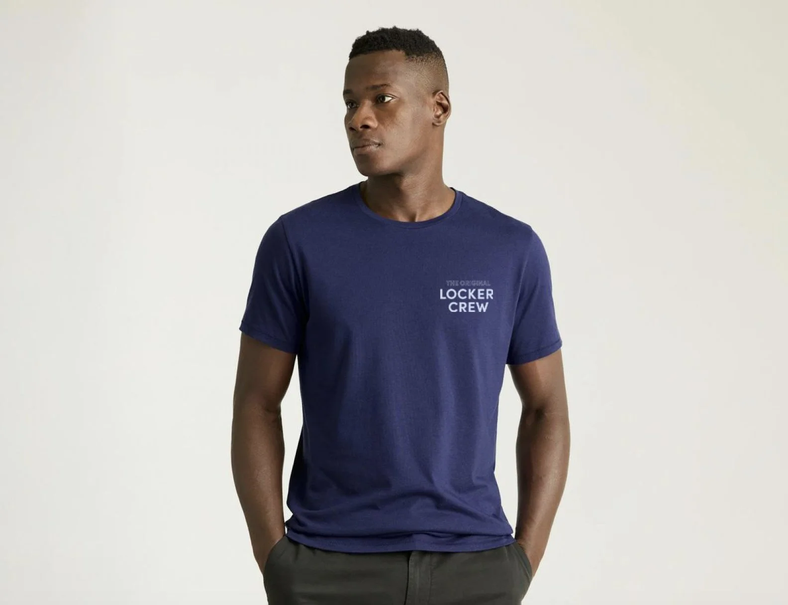
Deliverables: Locker Graphics • Signage • Icon System • Pop-Up Structures • Staff Apparel • Wayfinding
Protection. Simplicity. Community.
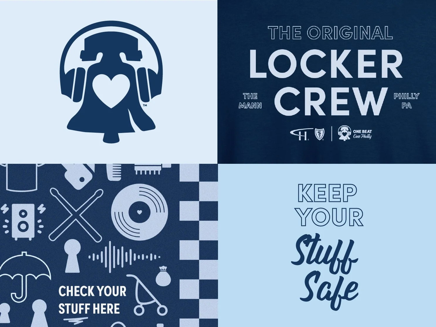
The design language transforms a functional service into a branded guest experience. Inspired by civic wayfinding systems and public safety signage, the visual identity uses confident typography, structured layouts, and bold iconography to create an immediate sense of trust.
The goal was to make guests instinctively feel:
This is official.
This is organized.
My belongings are safe.
Design Principles
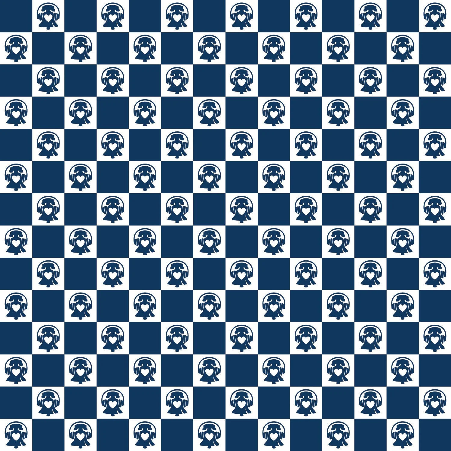
The visual language combines Highmark's signature navy, Deep Together Blue, and crisp white to create an environment that communicates confidence, reliability, and protection while remaining true to the brand. A custom iconographic system featuring simple geometric symbols—such as locks, keys, bags, shields, check marks, location pins, and directional arrows—provides clear, intuitive wayfinding that reinforces security and ease of use. My signature checker pattern adds rhythm and energy inspired by music, movement, and community, serving as a unifying graphic element across borders, environmental graphics, staff apparel, vehicle graphics, and signage to create a cohesive and memorable guest experience.